"EcoSSe - Eco Spatial Statistical evaluation", Envirosoft
2000,
EcoSSe -- Eco Spatial Statistical evaluation
Isobel Clark
Geostokos (EcoSSe) Limited,
Abstract
EcoSSe is a new Windows NT and 95/98 based application which has been developed from the more elaborate mining package, Geostokos Toolkit. It provides facilities for basic statistical analysis and advanced geostatistical analysis of sample data located in two dimensions.
The Toolkit software has
been developed over 25 years with some of its main extensions prompted
by environmental work. For example, simulation methods were
developed during work on the proposed nuclear waste isolation project in
This software is available now but expected to develop considerably over year 2000 as the needs of users become apparent. Unlike many other software companies, we expect our users and colleagues to suggest new applications and features at any time. We are also striving to make the software "user transparent" so that the user can concentrate on the analyses he/she wishes to carry out and not on how the software works.
1 Introduction
One of the major problems associated with environmental assessment, potential pollution problems and other types of earth science applications is that of producing maps from severely limited sample information. For example, in groundwater pollution studies, samples may only be available from existing water wells or limited extra drilling. The well sites will not have been selected to best reflect quality of the groundwater and will usually be sub-optimal for assessing pollution risk levels. Normal mapping packages may are unlikely to give adequate representation of the variables under study for several reasons:
· Most standard mapping methods assume a smooth continuous phenomenon, like a topographic surface;
· Mapping packages use only local variability ignoring large scale trends or dispersion patterns;
·
Interpolation methods tend to work best with
well-behaved
· Gridding methods work best with sample data which is fairly evenly distributed across the study area -- not clustered or highly irregular spacing.
To illustrate
these problems we present two case studies. The first is from the ONWI studies
carried out in the mid 1980’s [1] and shows the effect of clustered data and a strong
trend in values on subsequent maps. The second data set is taken from a paper
on dioxin contaminated residues dumped on a road in
2 Wolfcamp Case
Study
As part of
the risk assessment study for a proposed high level
nuclear waste repository in north-west

Figure 1: post plot of Wolfcamp sample
information
Geostatistical interpolation (like many other methods) is based on an assumption of no strong trend in the sample values. In cases where trend exists, the values are assumed to be composed of two components: a deterministic trend surface plus a ‘stochastic’ or statistical variable. Any interpolation method must include both components to be realistic. Trends can be fitted to the data:

Figure 2: quadratic trend surface fitted to
Wolfcamp data
It can be seen that individual sample values will differ from the ‘trend’ value at any specified location. These differences -- or residuals -- should be “detrended” and ordinary interpolation methods should be applicable. To map using geostatistical methods, we produce a weighting function known as the semi-variogram which models the continuity or predictability of values from one location to another.

Figure 3: semi-variograms from original
Wolfcamp data showing strong trend

Figure 4: semi-variograms after quadratic
trend has been removed
Notice in particular the difference in scale between the semi-variogram graphs before and after removing the trend component. Over 92% of the variation in the original data is accounted for by the trend in values. The other 18% can be interpolated by any mapping method. The geostatistical method known as “Universal Kriging’ will estimate the value at any given location and account for the trend as well as the continuity modelled in the semi-variogram.
One of the major advantages of a geostatistical approach to mapping is that every grid point estimated has an error associated with it. The likely size of this error is described by the ‘kriging standard error’ and is generally interpreted as the standard deviation of the estimation error. The logical consequence of this is that a kriging estimation produces two maps -- one for the estimation and one of standard errors.
The map of standard errors can be used to indicate where estimates are less reliable -- and, hence, where more sampling may be needed. The standard errors can also be used to produce simulations to test the sensitivity of the resulting maps. For example, the kriged map produced the ‘best’ estimate of values at given locations. However, the ‘true’ surface will be considerably rougher (more variable) than indicated by these smooth contours. Simulation puts back the roughness and allows us study likely variations between this ‘best’ answer and equi-probable outcomes. We used simulations to study the travel paths for radio-nucleides in the event of breech of the repository [3].
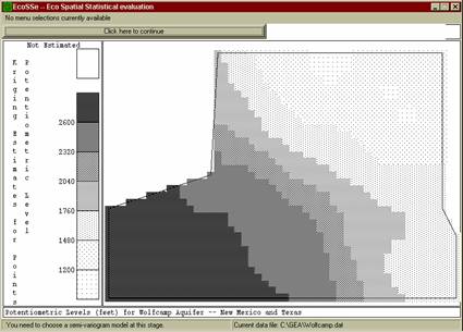
Figure 5: estimated map for potentiometric level in Wolfcamp aquifer
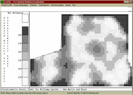
Figure 6: standard errors for prediction of potentiometric levels in Wolfcamp
The kriging interpolation technique is optimal in the sense that it minimises the estimation variance subject to the semi-variogram function and the locations of the samples used in the estimation. There are several implications which may not be immediately apparent:
· Kriging is an exact interpolator, honouring the sample data at the data locations;
· Kriging compensates for clustering in data locations, allocating weights to each sample which are adjusted by the inter-sample relationships as well as by the sample--estimated point relationship;
· Universal kriging automatically compensates for trend.
3
A truck transporting dioxin
contaminated residues dumped an unknown quantity of these wastes onto a
farm Road in
This
data set is complicated by two factors:
1.
A large proportion (55 of 127) of the sample data is given a flat value of 0.1 mu
g/kg. This phenomenon usually occurs because the values of the samples fall
below some "detection limit" and an arbitrary low value is assigned to the samples.
The probability plot in Figure 7 shows these ‘non
detects’ clearly.
2.
Those measurements which have been
taken follow a highly skewed distribution with a coefficient of
variation of around 16.
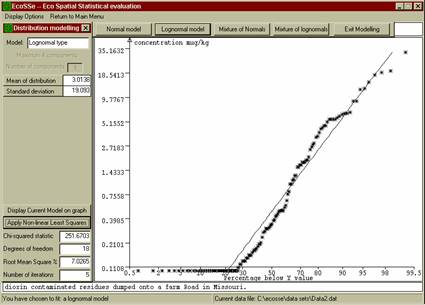
Figure 7: probability plot of dioxin
measurements along contaminated road.
Problem (1) above may be tackled by using an ‘indicator’ approach to discriminate between ‘non detect’ and ‘detect’ samples. In an indicator transform, all non detects would be replaced by the value ‘0’ and all detects (measured sample values) by ‘1’. A semi-variogram graph is constructed from these zero and one values, showing whether we can predict the likely occurrence of detectable values at any specified location. Figure 8 shows the semi-variogram obtained using an indicator value of 0.25 mg/kg.
Eliminating the non detect samples from consideration leaves us with a data set which is extremely highly skewed. Mapping these values with no allowance for this skewness will produce erroneous estimates. In general, high values will be smeared out of all proportion to their true influence and low values underplayed. Whilst the high values are of most interest to us in pollution studies, a realistic estimate is more desirable than one which is unduly alarmist.
Several alternatives are available to us for dealing with highly skewed data. In many cases a simple logarithmic transformation results in Normally distributed values -- that is, the original measured values follow a lognormal distribution. Figure 9 shows that this is quite likely for this set of sample data.

Figure 8: indicator semi-variogram for
detect/non-detect in dioxins

Figure 9: probability plot of dioxin values
grouped to eliminate tail
If a suitable parametric model cannot be found, rank transforms can be applied. Figure 10 shows a semi-variogram calculated from this data set using a rank transformation in value. The difference between the behaviour of measured values and ‘non detects’ can be clearly seen in this graph.
A similar graph was produced using a logarithmic transformation for measured sample values.
Summary
We have endeavoured to illustrate some ways in which a geostatistical analysis will differ from mapping by more conventional packages. This type of approach allows for methods which reflect the true distribution of the sample data -- both spatially and statistically.
A geostatistical analysis can also form the basis for risk assessment in pollution and other environmental studies, allowing for quantitative measures of confidence and reliability to be attached to such studies.
All illustrations in this paper have been produced using the EcoSSe package. Additional information on the EcoSSe software can be found at http://www.kriging.com or from ecosse@kriging.com.

Figure 10: semi-variograms on rank transform
of dioxin value showing detect/non-detect problem.
References
[1] Harper,
W.V. & Furr, J.M. Geostatistical analysis of potentiometric data in the Wolfcamp Aquifer of the Palo Duro Basin, Texas. Technical
Report BMI/ONWI-587, Battelle Memorial Institute,
[2] Zirschy, J.H. & Harris, D.J. Geostatistical analysis
of hazardous waste site data. Journal of
Environmental Engineering, Vol:112, pp. 770-784. 1986.
[3]