
Software Tutorial --- Calculation and modelling of semivariograms
The example session with PG2000 which is described below is intended as an example run to familiarise the user with the package. This documented example illustrates one possible set of analyses which may be carried out. One of the most neglected aspects of statistical analysis --- especially of spatial data --- is the purely visual assessment of the sample data. It takes you through the following sequence of analyses:
{#} Reading in a data file
{#} Calculating and interpreting a semi-variogram
There are many other facilities within the package, which are given as alternative options on the menus. To start the tutorial, choose PG2000 from your Start menu. See Tutorial One for starting up and specifying your ghost file output.
Reading in a data file
As you can see from the above I have elected to read in a
set of sample data by clicking on the ![]() option and selecting
option and selecting ![]() from the menu which appears. PG2000
will remember the last five data files accessed and include these in your
options. Three input file types can be read in. I will read in a standard
Geostokos data file.
from the menu which appears. PG2000
will remember the last five data files accessed and include these in your
options. Three input file types can be read in. I will read in a standard
Geostokos data file.
The layout of such files is described in detail in the main PG2000 documentation. The routine which reads in the data shows the first 10 lines of your data file so that you can check it is going in OK. The routine also checks whether we actually had the correct number of samples on the file and informs you if there is any discrepancy.
Even if you select a file from the list of previously analysed data files, PG2000 will ask you to confirm your choice. This is actually a quick way of getting back to your working directory, since you can change your choice at this point. Be warned, though, that if you change which file you want to read it must be the same type of file – that is, if you are reading a standard Geostokos data file, you cannot change your mind at this point and read in a CSV type file.
For this illustration, I have selected coalmine.dat for my input data file. This is a set of 116 borehole samples drilled into an unspecified coal seam in southern Africa. Several measurements are made on each sample: width of coal seam (metres); calorific value or energy content of the coal (KiloJoules); and the vertical location of the top of the seam (elevation). All co-ordinates are in metres.
As your data is read in, it is stored on a working binary file. A progress bar will indicate how far the process has gone. When data input is complete, your Window should look like this:

Semi-variogram calculation
When the data has been read in, you will see that the "greyed out" options on the main menu bar will be activated. We use the menu bar to select an option, say:

The screen will prompt you to choose the three variables for the analysis. You will see two dialog boxes: the one in the top left hand corner lists the variables available for analysis in your data file:

the bottom right box shows the variables already chosen (at this point, none!):

The routine, needs to have information on the position of the samples and on the value at each sample location. This particular data file only contains three variables. However, PG2000 does not know (as yet) which of these variables is which.
There is a lot of information on the screen. At the bottom of the Window, you see the "status bar" which shows the name of the current data file and the title read from that file. The "already chosen" dialog box shows you that you are expected to select variables to be the "X (east/west) co-ordinate", "Y (north/south) co-ordinate" and "Measurement to be analysed" for your semi-variogram.
The upper left dialog box lists the variable names as they appeared in the data file and is prompting you to choose the variable which will be the "X co-ordinate" on the graph. For this example, let us choose Easting for the X co-ordinate:


We may then choose "Northing" for the Y co-ordinate:


Finally, we must choose the variable to be analysed and
state any relevant transformations to be made. For this data we require no
transformation of the variable "Coal Value (KJ)", so click on
![]() .
The
.
The ![]() dialog now shows the complete set of chosen
variables and has moved to the upper left corner. You have the option to change
your mind here by clicking on
dialog now shows the complete set of chosen
variables and has moved to the upper left corner. You have the option to change
your mind here by clicking on ![]() .
.


This choice of variables is acceptable, so click on
![]() to proceed. This may seem tedious to you at
the moment, but (later) try running the program with another set of data with
more variables. Or try a data set where the columns are in a different order.
The PG2000
input routine has been written to allow you this flexibility in building your
data files.
to proceed. This may seem tedious to you at
the moment, but (later) try running the program with another set of data with
more variables. Or try a data set where the columns are in a different order.
The PG2000
input routine has been written to allow you this flexibility in building your
data files.
Now, we may finally proceed to calculating a semi-variogram. For the complete data set, samples are paired up. The difference between the values of the two samples is calculated and squared. Plotting each of these points on a graph -- results in a "variogram cloud".
For the semi-variogram interpretation and modelling routines the "differences" are grouped together into "distance" intervals. That is, all pairs of samples which are more or less the same distance apart are grouped together and the differences averaged. To do this, you must choose a distance interval and a number of groups. The maximum distance considered will be the product of these two values.
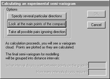
You have the opportunity to specify your own directions, in which case you will need to define direction as azimuth clockwise from North. Alternatively, you may accept the four default directions: 0o, 45o, 90o and 135o -- North, Northeast, East and Southeast. Finally, you can simply make a graph which ignores direction entirely and groups all possible pairs of samples into one semi-variogram. If you choose the "main points of the compass" you will also get the "omni-directional" semi-variogram. For user defined directions, you must also specify a tolerance angle to be allowed on either side of your specified azimuth. The default directions allow 22.5o either side, so that the four directions cover all possibilities. Choosing the main points of the compass:

Note that choosing this option reveals the two input boxes for "interval between points" and the number of intervals. There has been much discussion of the choice of lag interval in recent times. Sometimes, you just have to experiment. If you have absolutely no idea how far apart your samples are, do a nearest neighbour analysis before you try constructing a semi-variogram. This will give you some idea of the 'natural' spacing amongst your samples.
For the coalmine data, the average inter-sample spacing is around 440 metres, with a mode at around 225 metres.
A progress bar and two variogram cloud plots will appear on your screen to let you know that the calculation is proceeding. The software goes through the data set and make all possible pairs of one sample with another. For each, the distance between the sample locations is calculated. In addition, the difference in value between the samples is calculated and squared.

The above is the classic variogram cloud, where the horizontal axis is the distance between the sample locations and the vertical axis is the square of the difference between the sample values. Each point on the graph represents one pair. The graph below is a more modern presentation, where relative location of each pair is shown – i.e. relative distance east/west and relative distance north/south.

When all pairs have been found and the differences, distances and relative orientations found, the screen is modified in three ways:

The top left plot is overwritten in the following way: each square on the graph represents a 225 metre interval east/west and a 225 metre interval north/south. All pairs found in a particular square are averaged – to be strict, the "differences in value squared" for all those pairs is averaged. That average is then halved. This is called a 'semi-variogram map'. The top right hand graph shows the number of sample pairs which were found in each of those 225 by 225 metre squares. The more traditional method of presenting the semi-variograms is shown in the bottom right hand plot.
With our choices, all pairs of samples between 112.5 and 337.5 [225 ± 112.5] metres apart will be grouped together. For each of these pairs, the difference in value was calculated and squared. All of these values will be added together and divided by twice the number of pairs. This calculation will result in one point to be plotted on our final semi-variogram graph. This process will be repeated for all pairs of samples between 337.5 and 552.5 miles apart, and so on. Different directions are illustrated by different symbols in this graph.
New menus will appear at the top of the screen:

You can continue to look at your semi-variograms in the four
part screen or choose ![]() to magnify the bottom left hand plot into the
whole screen.
to magnify the bottom left hand plot into the
whole screen.

You will probably find this more useful for model fitting. The symbols in this graph are scaled to illustrate the number of pairs of samples which were found in that interval. The largest symbol in this graph has 102 pairs grouped together into one interval. The smallest point has only 2 pairs in its calculation and is, one would think, somewhat less reliable.
You can plot any, some or all of your calculated
semi-variograms at once. Select ![]() from the
from the ![]() menu and a new dialog will be displayed.
menu and a new dialog will be displayed.
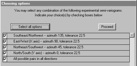
This dialog lists all of the semi-variograms which have been calculated (and for which the routine found pairs of samples). You may plot any combination of these calculated semi-variograms on the screen at once. Next to each calculated semi-variogram is a check box. At the top of the dialog, you will see the message "You may select one or more of these at one time". Check the boxes for the ones you want to plot.

At the right hand side of the dialog, you will see two small graphs. These indicate the type of graph you can plot. There are two ways in which the graph can be plotted.

Firstly as a symbol
for each calculated point on the graph, as we have seen above.

Secondly we can
provide a rougher, but perhaps more visually informative, graph by shading
areas.
Plotting the four directional semi-variograms using the shaded option, results in:

This display is produced as follows:
{#} For each calculated semi-variogram, we join the first point to the third, the third to the fifth and so on.
{#} The second point is joined to the fourth, the fourth to the sixth and so on.
{#} The area between these two lines is shaded.
This display is easier to interpret, especially for beginners. It does not, however, give any information about the number of pairs of samples in each interval. One single pair of samples giving an erratic high point can seriously distort the shaded graph. The best combination, perhaps, is to use the shaded graph to get an idea of shape, possible anisotropy etc, then use the symbol graphs to do the actual modelling.
When you have looked at the graphs to your heart's content, you will be offered the choice to fit a model to the calculated (or experimental) semi-variogram.
Note in particular the last option which enables you to store the experimental semi-variograms -- not the model -- on a text file for input to (say) a report quality graphics package. An PG2000 option (read in experimental semi-variograms) exists, which allows you to read this file back in and continue with the modelling stage.
Apart from an odd couple of erratic points, we see that the
four semi-variograms look very similar. We can, therefore, assume that we have
no apparent anisotropy. In this case,
we can elect to combine the four directions and plot only the
"omni-directional" semi-variogram. Select ![]() from the
from the ![]() menu and select the
menu and select the ![]() option.
option.

Fitting a semi-variogram model
It would now be appropriate to fit a model to the experimental graph, so that we can proceed to estimating unsampled locations.
We choose to plot only one calculated semi-variogram – the one which includes all pairs regardless of direction. In 'symbol' mode, we can show the number of pairs which went into each calculated point by the size of the symbol plotted.
Note that in this graph we can clearly see the number of pairs in each 'point' falling off as the distances get larger than half the extent of the study area (around 5,000 metres).
Now that we have a reasonable experimental semi-variogram, we can venture to fit a model to it. This is a mathematical function which can be used in the kriging routines to produce "optimal" linear estimates.

A dialog for semi-variogram model definition is provided:

At present the software offers a limited number of semi-variogram models which have proved useful in past applications. The names of the models available will appear in the dialog at the top of the screen. PG2000 will prompt you for the values of the necessary parameters for the chosen model. Full description of all available models in given in the full documentation and in Practical Geostatistics 2000.
In this example we chose a Spherical model by clicking on
![]() .
The dialog activates the table in which the parameters will appear. You can
manually change the values of the parameters at any stage except when
"adjusting the model".
.
The dialog activates the table in which the parameters will appear. You can
manually change the values of the parameters at any stage except when
"adjusting the model".
All models have the possibility for a "nugget effect" or discontinuity at zero distance. The first prompt asks you to specify this value by placing the cursor in the appropriate position and clicking the right button on your mouse.
![]()
As the cursor tracks across the screen, the value of the nugget effect will change in the left hand dialog:

Once you click the right mouse button, a red blob will appear at your chosen nugget effect.
You will then be prompted to move the cursor to choose where
the graph levels off, i.e. the range of influence and final sill. The cursor
will change to a hand grabbing ![]() . Horizontal
and vertical bars will appear around your cursor to help you visualise the
correct place to stop and right click your mouse.
. Horizontal
and vertical bars will appear around your cursor to help you visualise the
correct place to stop and right click your mouse.

When you finally click the right button on your mouse, a line will be drawn on the graph showing the specified model. You will notice that the model semi-variogram shows as a wide fuzzy line. This is intended to reflect the intuitive, subjective nature of model fitting.

If the model is totally the wrong shape, you might want to
start again by clicking on ![]() which will take you back to the list of
possible models and clear the parameter list.
which will take you back to the list of
possible models and clear the parameter list.
If you are happy with the model, click on ![]() .
This will remove the 'blobs' from the graph and return you to the main
semi-variogram menu. At any stage, you may save the experimental semi-variogram
and/or the model for the semi-variogram. If you have already saved a model on a
previous run, you can import it and replot the graph using the model fitting
option.
.
This will remove the 'blobs' from the graph and return you to the main
semi-variogram menu. At any stage, you may save the experimental semi-variogram
and/or the model for the semi-variogram. If you have already saved a model on a
previous run, you can import it and replot the graph using the model fitting
option.
As a measure of the goodness of fit of the model to the calculated points, the Cressie goodness of fit statistic is quoted at the bottom of the dialog. We use a modified version of this statistic which is standardised by the total number of pairs included in the graph. This gives a figure which is not influenced by the number of pairs and can, perhaps, be more objectively interpreted. The statistic is calculated as follows:
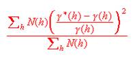
It is a good idea to get this as low as possible, but not at the expense of a good visual fit.
Given that the above model is not an attractive fit to the
points, we can improve the fit by changing the various parameters of the
semi-variogram. You can manually enter different values for the parameters or
you can choose the ![]() button. The latter option gives you the
possibility to right click on any 'blob' and move it around to improve the
model:
button. The latter option gives you the
possibility to right click on any 'blob' and move it around to improve the
model:
![]()
Once you select the point to be moved (remember to click the right button), the prompt will change to:

As you move the mouse, the model line will follow your hand. The parameters in the dialog will change as you move, including the Cressie goodness of fit statistic. Right click to fix the blob in place. You can select another blob, right click, move and right click to fix. You can do this as many times as you like until you have the best model.
When you want to stop moving blobs around, click on ![]() .
This will return you to the model fitting layout. To get a picture with no
blobs, click on
.
This will return you to the model fitting layout. To get a picture with no
blobs, click on ![]() which will return you to the main
semi-variogram menus.
which will return you to the main
semi-variogram menus.

Before quitting this routine, we might want to store the calculated semi-variograms in case we want to look at them again later. You can store any combination of the calculated semi-variograms on a file. PG2000 will prompt you for the name of the file. The default name is the original data file name with an extension of .SXP . You can change the default extension simply by typing in a new one. Alternatively you can change the whole name to something entirely different.
Choosing which semi-variograms to store is identical to choosing which ones to plot:
The stored semi-variograms can be read back in at any time using the option on the main menu:

Storing a semi-variogram model
You may also want to store your model on a file for future use in modelling or in the kriging routines:

You will be prompted for the name of the output file on which the model will be stored. This has a default name the same as your original data file and an extension of .par. Since we have several variables on this data file, we will choose to call the semi-variogram model file CV.par:

The model file is a flat text file listing all the possible semi-variogram parameters and can be accessed by Wordpad, Notepad or some such for reporting or editing.
Having done all we need to do with the semi-variogram calculation and modelling:

which returns you to the main menu bar.
This Tutorial is continued in Software Tutorial -- Ordinary Kriging.