Software Tutorial Session -- Semi-variograms on data with Trend
The example session with PG2000 which is described below is intended as an example run to familiarise the user with the package. This documented example illustrates one possible set of analyses which may be carried out. One of the most neglected aspects of statistical analysis -- especially of spatial data -- is the purely visual assessment of the sample data. It takes you through the following sequence of analyses:
{#} Reading in a data file
{#} Calculating and interpreting a semi-variogram for data with a "trend"
{#} Fitting a series of Polynomial Trend Surfaces, calculating a semi-variogram on the residuals and fitting a model
There are many other facilities within the package, which are given as alternative options on the menus. To start the tutorial, choose PG2000 from your Start menu. For starting up and specifying your ghost file, see Tutorial One.
We suggest strongly that this tutorial would be more useful to you if you first complete the tutorial on calculating and modelling semi-variograms without trend.
Reading in a data file
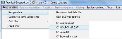
As you can see from the above I have elected to read in a
set of sample data by clicking on the ![]() Āoption and selecting
Āoption and selecting ![]() Āfrom the menu which appears. PG2000
will remember the last five data files accessed and include these in your
options.
Āfrom the menu which appears. PG2000
will remember the last five data files accessed and include these in your
options.
I have selected WOLFCAMP.DAT for my input data file. This is a set of 85 samples of hydrogeological data taken from the Wolfcamp aquifer in Northwestern Texas. The co-ordinates are in miles and the other measured variable is the Potentiometric pressure (or head) within boreholes intersecting the aquifer. The units of the variable are in feet above sea level.
The layout of such files is described in detail in the main PG2000 documentation. The routine which reads in the data shows the first 10 lines of your data file so that you can check it is going in OK. The routine also checks whether we actually had the correct number of samples on the file and informs you if there is any discrepancy.
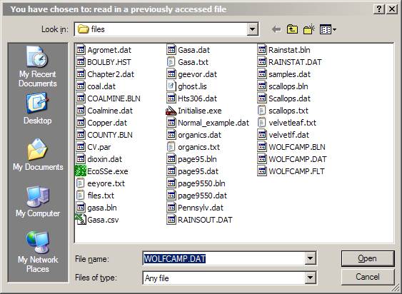
Even if you select a file from the list of previously analysed data files, PG2000 will ask you to confirm your choice. This is actually a quick way of getting back to your working directory, since you can change your choice at this point. Be warned, though, that if you change which file you want to read it must be the same type of file -- that is, if you are reading a standard Geostokos data file, you cannot change your mind at this point and read in a CSV type file.
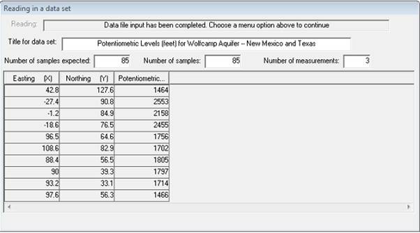
For this example, we will stick with style='font-family: "Courier New";WOLFCAMP. As your data is read in, it is stored on a working binary file. A progress bar will indicate how far the process has gone. When data input is complete, your Window should look like the dialog above.
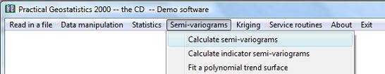
Semi-variogram calculation
When the data has been read in, you will see that the "greyed out" options on the main menu bar will be activated. We use the menu bar to select an option, say:Ā
This time we have chosen to display and summarise the data set in a spatial sense. A post plot is a map showing the locations of the samples. Each sample will be coloured and shaded according to the value of a selected variable. Since we are analysing the wolfcamp data, choice of variables should prove fairly simple!
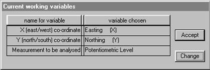
The screen will prompt you to choose the three variables for the analysis. You will see two dialog boxes: the one in the top left hand corner lists the variables available for analysis in your data file; the bottom right box shows the variables already chosen (at this point, none!):
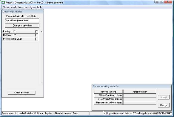
The routine needs to have information on the position of the samples and on the value at each sample location. This particular data file only contains three variables. However, PG2000 does not know (as yet) which of these variables is which.
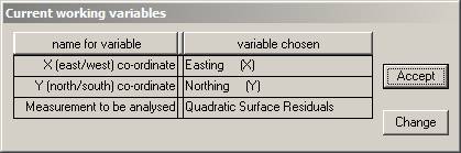
There is a lot of information on the screen. At the bottom of the Window, you see the "status bar" which shows the name of the current data file and the title read from that file. The "already chosen" dialog box shows you that you are expected to select variables to be the "X (east/west) co-ordinate", "Y (north/south) co-ordinate" and "Measurement to be analysed" for your semi-variogram. The upper left dialog box lists the variable names as they appeared in the data file and is prompting you to choose the variable which will be the "X co-ordinate" on the graph. For this example, let us choose Easting for the X co-ordinate:
The screen will prompt you to choose the three variables for the analysis. You will see two dialog boxes: the one in the top left hand corner lists the variables available for analysis in your data file; the bottom right box shows the variables already chosen (at this point, none!).
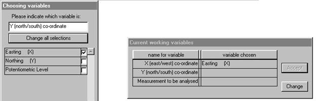
We may then choose "Northing" for the Y co-ordinate:
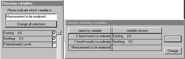
Finally, we must choose the variable to be analysed and state any relevant transformations to be made.
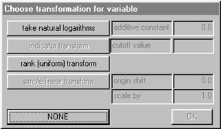
For this data we require no transformation of the variable
"Potentiometric Level", so click on ![]() .
The
.
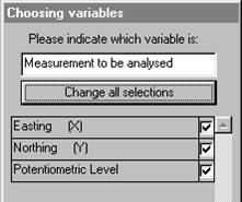
The ![]() Ādialog now shows the complete set of chosen
variables and has moved to the upper left corner. You have the option to change
your mind here by clicking on
Ādialog now shows the complete set of chosen
variables and has moved to the upper left corner. You have the option to change
your mind here by clicking on ![]() .
.
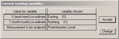
This choice of variables is acceptable, so click on
![]() Āto proceed. This may seem tedious to you at
the moment, but (later) try running the program with another set of data with
more variables. Or try a data set where the columns are in a different order.
The PG2000input routine has been written to allow you this flexibility in building
your data files.
Āto proceed. This may seem tedious to you at
the moment, but (later) try running the program with another set of data with
more variables. Or try a data set where the columns are in a different order.
The PG2000input routine has been written to allow you this flexibility in building
your data files.
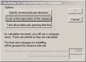
Now, we may finally proceed to calculating a semi-variogram. For the complete data set, samples are paired up. The difference between the values of the two samples is calculated and squared. Plotting each of these points on a graph -- Āsquared difference versus distance -- results in a "variogram cloud". For the semi-variogram modelling routines the "differences" are grouped together into "distance" intervals. That is, all pairs of samples which are more or less the same distance apart are grouped together and the differences averaged. To do this, you must choose a distance interval and a number of groups. The maximum distance considered will be the product of these two values. Ā
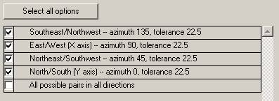
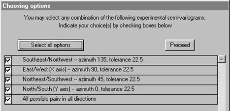
You have the opportunity to specify your own directions, in which case you will need to define direction as azimuth clockwise from North. Or you may accept the four default directions: 0░, 45░, 90░ and 135░ -- North, Northeast, East and Southeast. Alternatively you can simply make a graph which ignores direction entirely and groups all possible pairs of samples into one semi-variogram. If you choose the "main points of the compass" you will also get the "omni-directional" semi-variogram. For user defined directions, you must also specify a tolerance angle to be allowed on either side of your specified azimuth. The default directions allow 22.5░ either side, so that the four directions cover all possibilities. Choosing the main points of the compass:Ā
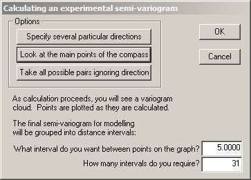
Note that choosing this option reveals the two input boxes for "interval between points" and the number of intervals. Ā
With our choices, all pairs of samples between 2.5 and 7.5 miles apart will be grouped together. For each of these pairs, the difference in value will be calculated and squared. All of these values will be added together and divided by twice the number of pairs. This calculation will result in one point to be plotted on our final semi-variogram graph. This process will be repeated for all pairs of samples between 7.5 and 12.5 miles apart, and so on. The maximum distance considered will be 5 x 31 = 155 miles.
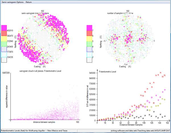
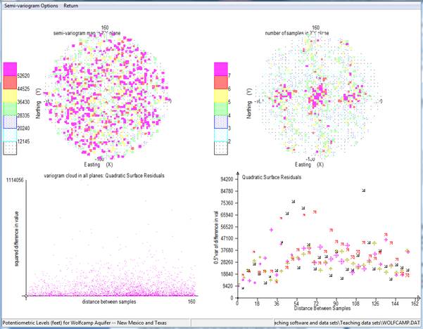
A progress bar and two variogram cloud plots will appear on your screen to let you know that the calculation is proceeding. The software goes through the data set and make all possible pairs of one sample with another. For each, the distance between the sample locations is calculated. In addition, the difference in value between the samples is calculated and squared.
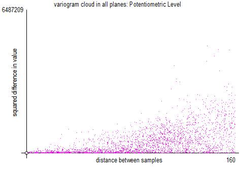
The above is the classic variogram cloud, where the horizontal axis is the distance between the sample locations and the vertical axis is the square of the difference between the sample values. Each point on the graph represents one pair.
When all pairs have been found and the differences, distances and relative orientations found, the screen is modified in three ways.
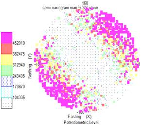
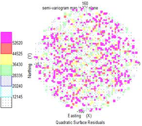
The top left plot is overwritten in the following way: each square on the graph represents a 5 mile interval east/west and a 5 mile interval north/south. All pairs found in a particular square are averaged -- to be strict, the "differences in value squared" for all those pairs is averaged. That average is then halved. This is called a 'semi-variogram map'.
The top right hand graph shows the number of sample pairs which were found in each of those 5 by 5 mile squares. The more traditional method of presenting the semi-variograms is shown in the bottom right hand plot.
The bottom right hand graph shows the classical display for semi-variogram graphs.
With our choices, all pairs of samples between 2.5 and 7.5 [5 ▒ 2.5] metres apart will be grouped together. For each of these pairs, the difference in value was calculated and squared. All of these values will be added together and divided by twice the number of pairs. This calculation will result in one point to be plotted on our final semi-variogram graph. This process will be repeated for all pairs of samples between 7.5 and 12.5 miles apart, and so on.
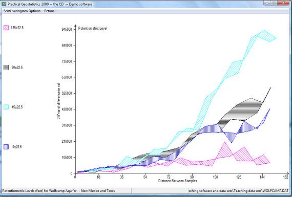
Different directions are illustrated by different symbols in this graph.
The standard page when you select the 'default' directions (shown above), shows you the four major directions in the bottom right hand corner.
If you proceed directly to modelling these semi-variograms (especially the north-east direction), you will find that none of the standard models will fit to this graph. The behaviour of this graph is "parabolic". That is, the difference is growing as the square (or higher) of the distance.
New menus will appear at the top of the screen:
You can continue to look at your semi-variograms in the four
part screen or choose ![]() Āto magnify the bottom right hand plot into the
whole screen.
Āto magnify the bottom right hand plot into the
whole screen.
When you select ![]() Āfrom the
Āfrom the ![]() Āmenu, a new dialog will be displayed.
Āmenu, a new dialog will be displayed.
This dialog lists all of the semi-variograms which have been calculated (and for which the routine found pairs of samples). Ā You may plot any combination of these calculated semi-variograms on the screen at once. Next to each calculated semi-variogram is a check box. At the top of the dialog, you will see the message "You may select one or more of these at one time". Check the boxes for the ones you want to plot.
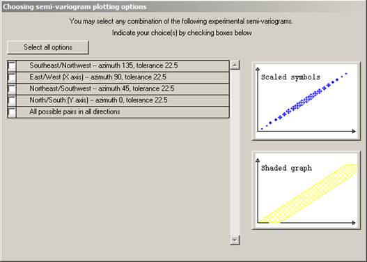
At the right hand side of the dialog, you will see two small graphs. These indicate the type of graph you can plot. There are two ways in which the graph can be plotted. Firstly as a symbol for each calculated point on the graph. The symbol size is proportional to the number of pairs of samples which have been averaged to obtain that point.Ā
Choosing the four directions, omitting the omni-directional, and clicking on the lower of the plotting options -- the scaled symbols plot -- results in the graph on the following page. Ā
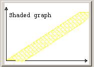
This display is produced as follows:
{#} For each calculated semi-variogram, we join the first point to the third, the third to the fifth and so on.
{#} The second point is joined to the fourth, the fourth to the sixth and so on.
{#} The area between these two lines is shaded.
This display is easier to interpret, especially for beginners. It does not, however, give any information about the number of pairs of samples in each interval. One single pair of samples giving an erratic high point can seriously distort the shaded graph. The best combination, perhaps, is to use the shaded graph to get an idea of shape, possible anisotropy etc, then use the symbol graphs to do the actual modelling.Ā
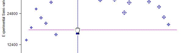
When you have looked at the graphs to your heart's content, you will be offered the choice to fit a model to the calculated (or Ā experimental) semi-variogram. With this particular data set we should not fit a model since it is apparent that a significant trend in values is present. The difference between sample values in the north-east/south-west direction is markedly greater than that in the north-west/south-east direction. This is not a consistent difference, since the NE/SW graph rises parabolically to an order of magnitude greater than that in the opposite direction. The two intermediate directions lie between these two individual lines.
The obvious interpretation of this behaviour is that there is a significant and consistent trend in values over the study area. Such a trend, if mapped, would show contour lines running north-west/south-east. The basic assumptions for the construction and modelling of a semi-variogram -- not to mention its use in estimation -- are that there is no significant trend in the values which are used in the construction of the semi-variogram graph. To proceed with geostatistical modelling we must first investigate the trend (or drift) in the sample data.
To return to the main menu bar, click on "Return" from the semi-variogram menus. We will return to the other options later. Ā
Note in particular the third option which enables you to store theĀ experimental semi-variograms -- not the model -- on a text file for input to (say) a report quality graphics package. An PG2000 option (read in experimental semi-variograms) exists, which allows you to read this file back in and continue with the modelling stage.Ā
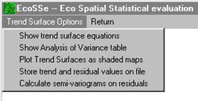
Trend Surface Analysis
The Wolfcamp data exhibits a very strong polynomial type trend in values. Before we can analyse this data geostatistically, we must investigate this trend. There are two reasons for this. Firstly, the calculation of a semi-variogram is only valid on data which do not exhibit a trend. The parabolic upturn in the graph warned us that we were trespassing on forbidden ground. To produce a valid semi-variogram we must remove the trend and recalculate the graph on the remaining "residual" variation. Ā
Secondly, if we proceed to geostatistical estimation (Kriging) then we must provide the semi-variogram of the residual variation plus an indication of what kind of trend we expect to find. There are many ways of approaching this problem. PG2000 offers you one of the simplest - Polynomial Trend Surface Analysis. This analysis fits three surfaces to your data - a planar or linear surface, a quadratic (dome or bowl) surface and a cubic (saddle point) surface. Statistical analyses are provided to help you judge which is most appropriate or whether you need something a little more specialised. Contour maps are also provided to give you a visual indication of the shape of the smooth, underlying, trend on your data.
PG2000 remembers which variables you have been analysing, checks them to make sure you have all you need and offers these as acceptable for the trend surface analysis: Ā
Click on ![]() Āto continue studying the same combination of
variables. The three surfaces will be fitted by standard least squares
regression. A menu bar will appear offering you various options.
Ā
Āto continue studying the same combination of
variables. The three surfaces will be fitted by standard least squares
regression. A menu bar will appear offering you various options.
Ā
Choosing the ![]() Āoption will bring up a dialog box which
contains the calculated coefficients for each term in the three trend
surfaces.Ā
Āoption will bring up a dialog box which
contains the calculated coefficients for each term in the three trend
surfaces.Ā
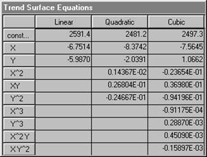
X represents the first co-ordinate (left-right on maps), and Y the second (bottom-top). It is difficult to judge from the coefficients listed above, just which of these surfaces might "best" describe the Wolfcamp data. The residual variation as discussed above is the difference between what the trend says is there (the equation) and what the actual value was. We usually choose a surface which makes the residual variation as small as possible. A traditional method used by geologists since the mid 1950's is simply to calculate the sum of the squared residuals and compare this as a percentage of the original variation. PG2000 will do this.
A more formal method used by statisticians to judge the
suitability of a Least Squares fit is the Analysis of Variance. This analysis
requires that the residuals should be independent of one another. We hope that
this is not the case in a geostatistical analysis. However, we feel that the
Analysis of Variance is another way of getting an intuitive "feel" for which
surface (if any) may be best. Choosing ![]() Āfrom option menu produces an approximate
analysis for three fitted trend surfaces.
Āfrom option menu produces an approximate
analysis for three fitted trend surfaces.
The table shown below is described in full in the main documentation, so we will discuss it only briefly here. The final column is the important one. Under statistical assumptions of Normality and independence, the statistics shown in this last column would follow the F distribution. Tables of F distribution statistics at various levels of "significance" are available widely. The first item in the last column in the table is a value of 338.76. This statistic compares the variation on the original set of sample data with that left after fitting a linear (planar) surface. Looked at very simplistically we might say that fitting a linear trend surface has reduced the variation amongst the sample values by a factor of over 300. In other words, a simple surface described by two coefficients "explains" a significant proportion of the variability in the original sample values. These two coefficients are the ones shown in the equation dialog above multiplying the terms X and Y.
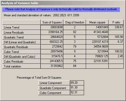
Now, when you look at the next division in the table there are two figures in the right hand column. The first compares the fitting of a quadratic surface -- with its five coefficients -- with assuming that there is no trend. In this case the figure is 165.94 indicating that a very significant proportion of the original variation can be "explained" by a quadratic trend surface. This figure is lower than the linear F statistic, partly because we have had to calculate more coefficients. However, it might be because the quadratic is not a lot better than the linear surface. To compare these directly we produce the second figure. This is a measurement of how much more variation is explained by the quadratic than was already explained by the linear. In short, the amount of extra variation explained by the inclusion of three extra coefficients. The F statistic calculated for this WOLFCAMP data was 6.37. In our simplistic interpretation we can interpret this statistic as comparing
{#} the variation explained by the extra terms in the trend equation with
{#} the variation remaining after the trend has been removed.
ĀThat is, the extra coefficients in the quadratic trend are explaining six times the remaining (residual) variation. This would seem to be significant.
The last division in the table shows similar statistics for the cubic surface. Comparing the cubic surface with "no trend at all" gives an F statistic ofĀ 100.02 Ā which would appear to be significant. Comparing the cubic surface with the quadratic, however, gives 2.45. If our residuals were independent of one another we could compare this figure to the standard F tables to be found in any statistics book. These tables would show us that a value of 2.45 could be encountered purely by chance even if there was no trend. This is what is meant by the statisticians' phrase "not significant". Thus we have no real evidence that the cubic surface is actually any better than the quadratic.
Another intuitive measure, popular with geologists, is simply to ratio the "sum of squares" explained by a trend surface with the total sum of squares before a surface is fitted. These statistics should be used with caution. It is possible to produce a completely random set of data which will show impressive "percentages explained". This can lead to spurious conclusions.
Another intuitive way to compare the surfaces would be to calculate the residuals from each, calculate an experimental semi-variogram on each and compare them visually. When a sufficient order of trend has been selected, the parabolic rise should disappear from the graph. If too high an order is selected, the graph will turn downwards.
Visualising the trend
None of these criteria will give you a hard-and-fast objective decision factor as to which surface is the best of the three fitted. It is always possible that a different style or order of trend is necessary. A visual assessment of the trend is often a great help to deciding which one is most significant.
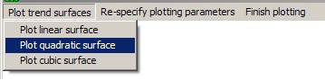
You can choose to look at the Linear, Quadratic and Cubic surfaces in any order.
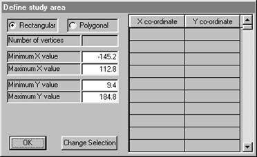
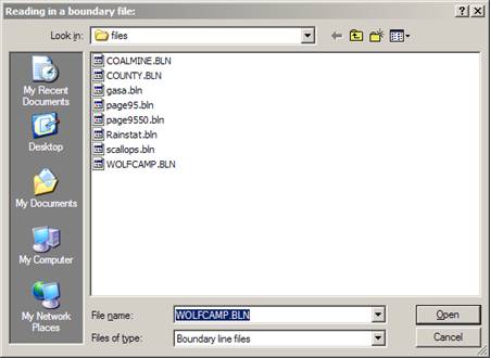
To plot a map, you have to specify the area which you wish to be mapped. PG2000 will offer a default rectangular area which covers all of the sample locations. You may accept this default or you may prefer a different rectangle or an irregularly shaped area. The last choice can only be made if you have already stored the boundary of the area as a set of vertices of a polygon. The current version of PG2000 can handle polygonal boundaries with up to 500 vertices. Ā
Clicking in the polygonal "radio button" will cause the software to ask you for a file containing the boundary information.
Ā Accepting this boundary returns us to the area definition dialog. Ā
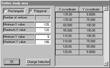
You may respecify the minimum and maximum X and Y values at this point. The defaults given in the dialog are the full extent of the polygonal boundary. However, there are times when you might want to have the estimated grid points on some regular grid starting at a standardised value. For example, changing "Minimum Y value" to 0 would mean that the bottom left hand corner of the grid used would be at X = -135, Y = 0.
Once you have chosen the area to be studied, you must define the grid spacing to be used. Points will be calculated at each grid node and represented on the screen as a shaded rectangle of the appropriate size. Ā
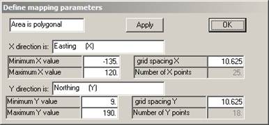
Since we have not previously specified a grid spacing or number of grid points, the software defaults to 25 points in the X direction and the same grid spacing in the Y direction. The grid does not have to be square, but the map may look a little strange if it isn't!
We can alter the grid spacing by changing the number in the relevant box:Ā
If you want to check how many grid points we now have, click
on ![]() Āand the rest of the parameters will be
updated. You may also change minimum and maximum X and Y values at this stage.
Once you click on
Āand the rest of the parameters will be
updated. You may also change minimum and maximum X and Y values at this stage.
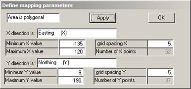
Once you click on ![]() Āthe map parameters will be defined.
Ā
Āthe map parameters will be defined.
Ā
Obviously, the finer the grid the smoother the contours. In this case, the grid used will be square -- i.e. 5 miles in both X and Y directions.
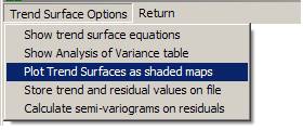
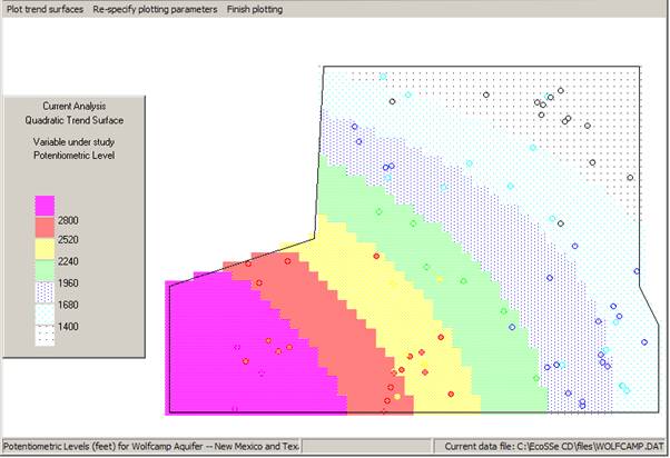
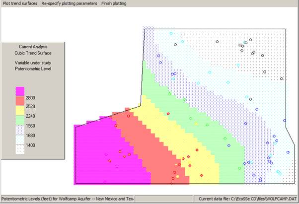
Knowing that the Linear Surface is not the most significant, we skip this one and proceed to the Quadratic. The software will suggest contour levels for the shaded plot.
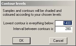
These may be altered as you desire. Click on ![]() Āto proceed to the map.
Ā
Āto proceed to the map.
Ā
The sample data is post-plotted on the map on top of the contours. In this way we can see that some of the sample values are above the prevailing trend and some are below. A trend surface is not -- in any sense -- a contouring method. It merely picks out a large scale movement in the "expected" (mean) value over the area. You can plot the other trends for visual comparison. See overleaf for quadratic and cubic surfaces.
When you have finished looking at the maps, click on the
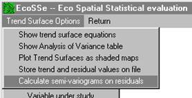
Calculate semi-variograms on the residuals
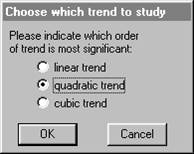
We have chosen to study the residuals from the linear trend surface. The trend surface routine will use the same semi-variogram calculation routine as before -- directly, passing to it the residual values rather than the original sample values. You must indicate which trend surface you feel is most significant:Ā
Note that each routine reminds you of which variables you are analysing at this moment. This information will also appear on the plotted semi-variogram.Ā
If you click on anything other than ![]() Āat this point, I will not answer for the consequences!
Āat this point, I will not answer for the consequences!
Calculating the "experimental" semi-variograms follows exactly the same procedure as before. The only difference you will see is in the results. Instead of using the actual sample value, the semi-variogram is being fitted to the difference between this actual value and the value of the linear trend equation at those co-ordinates. These "linear residuals" should, hopefully, be trend-free and we will be able to see the "true" shape of the semi-variogram.Ā
Clicking on ![]() Āwill allow the software to proceed to
calculating the experimental semi-variograms. The semi-variogram cloud will
appear while calculation proceeds. Then you will be offered the chance to plot
the semi-variograms exactly as before.
Āwill allow the software to proceed to
calculating the experimental semi-variograms. The semi-variogram cloud will
appear while calculation proceeds. Then you will be offered the chance to plot
the semi-variograms exactly as before.
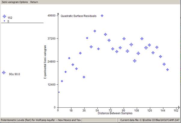
If you compare this with the previous semi-variograms with the trend, you will see that the scale on the vertical (differences) axis has been reduced by a factor of 10. This is a direct reflection of how much the variance was reduced by fitting the surface -- 89.20% according to the Analysis of Variance dialog.
Note that we have chosen to look at all four directions once more, rather than assume that the differences between the directions will automatically vanish.
Apart from an odd couple of erratic points, we see that the four semi-variograms look very similar. We can, therefore, assume that we have eliminated the apparent anisotropy by removing a polynomial type of trend.
It is also useful to compare both the pattern and the scales on the two semi-variogram 'map' displays:
Fitting a semi-variogram model
It would now be appropriate to fit a model to the experimental graph, so that we can proceed to estimating unsampled locations. We can fit the semi-variogram model to the detailed graph above. However, a clearer picture would be obtained by looking at the "all direction" graph. ĀĀĀ
We have chosen to plot only one calculated semi-variogram -- the one which includes all pairs regardless of direction. In graphics mode, we can show the number of pairs which went into each calculated point by the size of the symbol plotted. Now that we have a reasonable experimental semi-variogram, we can venture to fit a model to it. This is a mathematical function which can be used in the kriging routines to produce "optimal" linear estimates.Ā
For a detailed example of semi-variogram model fitting, see Semi-variogram Tutorial in 2D).
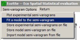
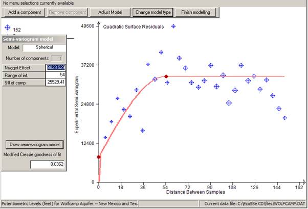
At present the software offers a limited number of semi-variogram models which have proved useful in past applications. The names of the models available will appear in the dialog at the top of the screen.Ā
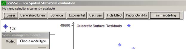
PG2000Ā will prompt you for the values of the necessary parameters for the chosen model. In this example we chose a Spherical model.
In this example we chose a Spherical model by clicking on
![]() .
The dialog activates the table in which the parameters will appear. You can
manually change the values of the parameters at any stage except when
"adjusting the model".
.
The dialog activates the table in which the parameters will appear. You can
manually change the values of the parameters at any stage except when
"adjusting the model".
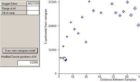
All models have the possibility for a "nugget effect" or discontinuity at zero distance. The first prompt asks you to specify this value by placing the cursor in the appropriate position and clicking the right button on your mouse.Ā
![]()
As the cursor tracks across the screen, the value of the nugget effect will change in the left hand dialog:
 ĀĀĀĀĀĀ
Once you click the right mouse button, a red blob will appear at your chosen nugget effect.
You will then be prompted to move the cursor to choose where
the graph levels off, i.e. the range of influence and final sill. The cursor
will change to a hand grabbing ![]() . Horizontal
and vertical bars will appear around your cursor to help you visualise the
correct place to stop and right click your mouse.
. Horizontal
and vertical bars will appear around your cursor to help you visualise the
correct place to stop and right click your mouse.
When you finally click the right button on your mouse, a line will be drawn on the graph showing the specified model. You will notice that the model semi-variogram shows as a wide fuzzy line. This is intended to reflect the intuitive, subjective nature of model fitting. Ā
If the model is totally the wrong shape, you might want to
start again by clicking on ![]() Āwhich will take you back to the list of
possible models and clear the parameter list.
Āwhich will take you back to the list of
possible models and clear the parameter list.
If you are happy with the model, click on ![]() .
This will remove the 'blobs' from the graph and return you to the main
semi-variogram menu. At any stage, you may save the experimental semi-variogram
and/or the model for the semi-variogram. If you have already saved a model on a
previous run, you can import it and replot the graph using the model fitting
option.
.
This will remove the 'blobs' from the graph and return you to the main
semi-variogram menu. At any stage, you may save the experimental semi-variogram
and/or the model for the semi-variogram. If you have already saved a model on a
previous run, you can import it and replot the graph using the model fitting
option.
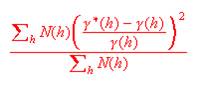
As a measure of the goodness of fit of the model to the calculated points, the Cressie goodness of fit statistic is quoted at the bottom of the dialog. We use a modified version of this statistic which is standardised by the total number of pairs included in the graph. This gives a figure which is not influenced by the number of pairs and can, perhaps, be more objectively interpreted. The statistic is calculated as follows: Ā
It is a good idea to get this as low as possible, but not at the expense of a good visual fit.
Given that the above model is not an attractive fit to the
points, we can improve the fit by changing the various parameters of the
semi-variogram. You can manually enter different values for the parameters or
you can choose the ![]() Ābutton. The latter option gives you the
possibility to right click on any 'blob' and move it around to improve the
model:
Ābutton. The latter option gives you the
possibility to right click on any 'blob' and move it around to improve the
model:
![]()
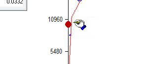
Once you select the point to be moved (remember to click the right button), the prompt will change to:
![]()
Adjusting model, I came up with:
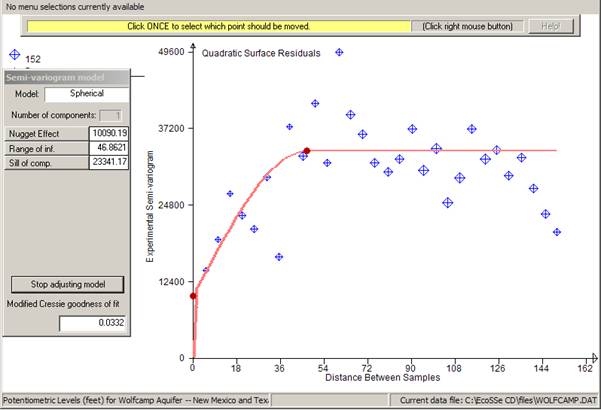
Note that the Cressie statistic for this model is around 10%
lower than the previous one. We can use the statistic as a relative measure of
goodness of fit for models - combined with the visual fit on the graph. Now, let
us suppose that we are satisfied with this fit, and wish to make no more tries
at fitting a semi-variogram. We click ![]() Āand then
Āand then ![]() ,
which returns us to the semi-variogram menu bar.
,
which returns us to the semi-variogram menu bar.
Before quitting this routine, we might want to store the calculated semi-variograms in case we want to look at them again later. Ā You can store any combination of the calculated semi-variograms on a file.Ā PG2000 will prompt you for the name of the file. The default name is the original data file name with an extension of .SXP. You can change the default extension simply by typing in a new one. Alternatively you can change the whole name to something entirely different.Ā
Choosing which semi-variograms to store is identical to choosing which ones to plot:Ā
The stored semi-variograms can be read back in at any time using the option on the main menu:
Storing a semi-variogram model
You may also want to store your model on a file for future use in modelling or in the kriging routines:
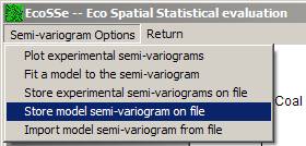
You will be prompted for the name of the output file on which the model will be stored. This has a default name the same as your original data file and an extension of .par.
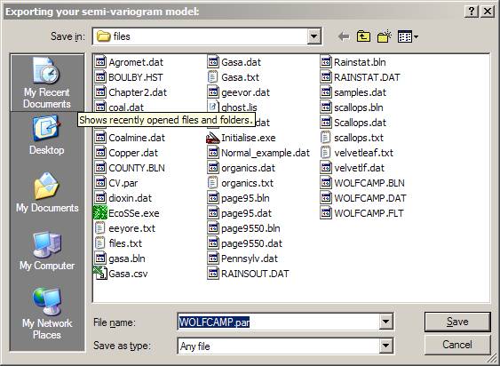
The model file is a flat text file listing all the possible semi-variogram parameters and can be accessed by Wordpad, Notepad or some such for reporting or editing.
Having done all we need to do with the semi-variogram calculation and modelling:Ā
Remember that we got to the semi-variogram calculation from the trend surface analysis routine. Rather than being returned to the main menu, we are returned to the trend surface menu. Ā
![]()
Clicking on ![]() Āhere will send us back to the main menu.
Ā
Āhere will send us back to the main menu.
Ā

Analysis of this data is continued in Tutorial Session -- Universal Kriging.